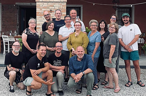
TipoItalia23, The Art of Lettering in Northern Italy
For two weeks in June 2023 I was absolutely fortunate to be an active “learner” in the wonderful and inaugural typographic workshop, TipoItalia23.
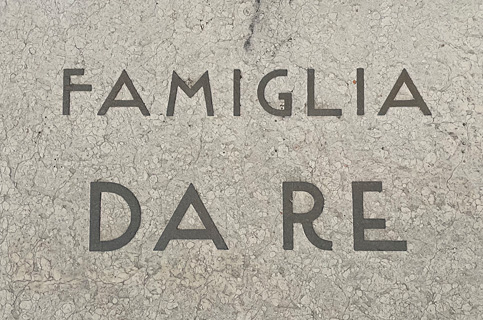
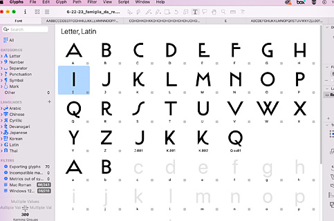
Based at Tipoteca Italiana Fondazione in Cornuda, Italia (see several previous posts), this typographic workshop was a type nerds dream. There were twelve learners/students led by the kind, generous and extremely talented, Bill Moran and the equally charming and delightful Sandro Berra, Director of Tipoteca (along with our dear friend, Leonardo Facchin). TipoItalia23 was described as “The Art of Lettering in Northern Italy,” and it completely lived up to all of this and more. At the beginning of the workshop we worked in an analog manner with the physical type of the Tipoteca collection. Throughout the workshop we were studying typography everywhere we could find it, from street signs of Venice to the typography within cemeteries. And by the end of the workshop we were all designing and producing our own version of digital fonts based on our ongoing inspiration using the type design Glyph software. All in all it was an absolutely amazing experience!
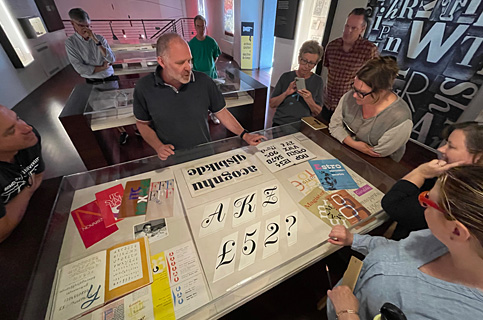
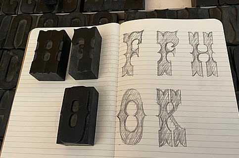
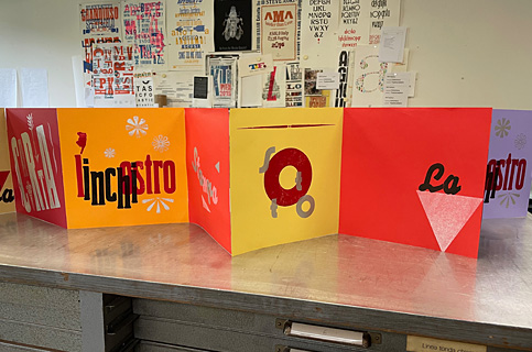
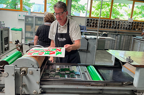
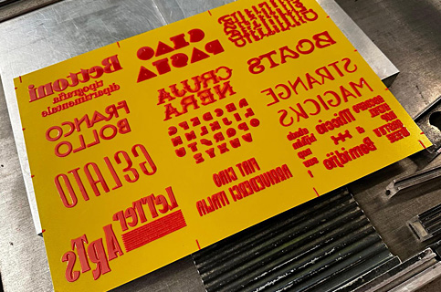
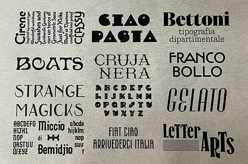
We started by exploring the collection of (mostly) wood type within Tipoteca; and then proofing some of this type and working on smaller exercises (as opposed to “finished/polished” prints), such as drawing type; designing and printing with a partner one page in a collective book; and printing our own type specimen sheets.
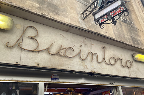
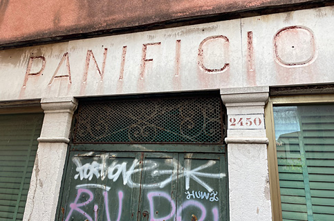
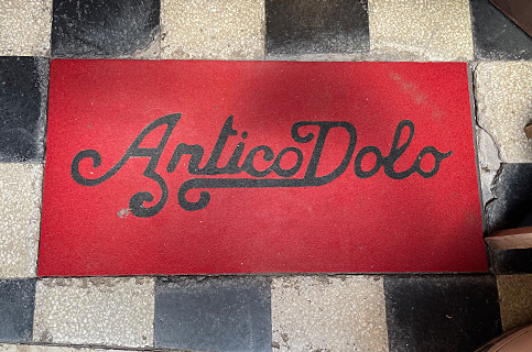
For me the real highlights of the experience were the several day trips to destinations in northern Italy like Treviso, Venice, Rovereto and Milan. In Venice we took a great walking tour led by Andrea Carrer, a young Italian graphic designer/lettering artist to look at and study the many different shop signs in this completely intriguing and special place. Highlight of Rovereto was visiting the Casa Depero of Fortunato Depero, a Futurist artist working at the beginning of the 1900s. We also visited Arte Sella, a wonderful outdoor sculpture space in the Dolomite mountains.
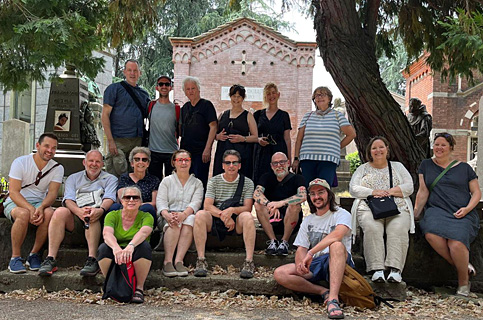
A highlight of the Milan day trip was visiting the Cementerio Monumental de Milan with a guided tour by the extraordinary James Clough looking at the wide variety of typography on tombstones and memorials (for all of these, please see Instagram posts for more images and details).
This experience was very different than—and yet similar to—my “printcation” of Summer 2022 at Tipoteca. Of course being back at Tipoteca was wonderful, and familiar (love that feeling of familiarity with this special place). The differences this time were:
—being part of a group; I loved being able to share the experiences of what we were learning/seeing/and doing with other type nerds in real time.
—the field trips were spectacular as we visited places I had not seen during previous trips.
—and quite honestly, being a learner within a group, and having assignments was very different in that I was completely on my own last summer and basically doing whatever I wanted. The most challenging experience was working within the Glyph software to produce our own digital font (see below); but in the end a very cool experience to select your own font from the drop-down menu.
All in all, I really did greatly enjoy this experience and would highly, highly, highly recommend to others. As stated, this version was the inaugural one, with plans moving forward for additional TipoItalias in the future. Buona fortuna!
